


 13/04/2010
 0
0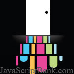 Xu hướng cuộn và trượt để chuyển đến đối tượng cần duyệt trên cùng một trang web đang là "mốt" thiết kế hiện nay. Trước đây, để áp dụng hiệu ứng này, các nhà phát triển web thường phải sử dụng Flash; nhưng hiện tại với sự hỗ trợ mạnh mẽ của các thư viện JavaScript, tính năng này được thực hiện khá mượt và dễ dàng cài đặt, chỉnh sửa.
Và bài viết này nhằm thống kê giúp bạn các bộ (mã nguồn) trượt và cuộn được xem là đẹp nhất hiện nay, được sử dụng trên 12 website khác nhau, vui lòng đọc bài viết chi tiết để xem thêm.
- Demo
- Phóng to
- Tải lại
- Cửa sổ mới
Miễn phí web hosting 1 năm đầu tại iPage
Nếu bạn vẫn còn đang tìm kiếm một nhà cung cấp hosting đáng tin cậy, tại sao không dành chút thời gian để thử với iPage, chỉ với không quá 40.000 VNĐ/tháng, nhưng bạn sẽ được khuyến mãi kèm với quà tặng trị giá trên 10.000.0000 VNĐ nếu thanh toán cho 24 tháng ~ 900.000 VNĐ?
Có trên 1 triệu khách hàng hiện tại của iPage đã & đang hài lòng với dịch vụ, tuyệt đối chắc chắn bạn cũng sẽ hài lòng giống họ! Quan trọng hơn, khi đăng ký sử dụng web hosting tại iPage thông qua sự giới thiệu của chúng tôi, bạn sẽ được hoàn trả lại toàn bộ số tiền bạn đã sử dụng để mua web hosting tại iPage. Wow, thật tuyệt vời! Bạn không phải tốn bất kì chi phí nào mà vẫn có thể sử dụng miễn phí web hosting chất lượng cao tại iPage trong 12 tháng đầu tiên. Chỉ cần nói chúng tôi biết tài khoản của bạn sau khi đăng ký.
Nếu muốn tìm hiểu thêm về ưu / nhược điểm của iPage, bạn hãy đọc đánh giá của ChọnHostViệt.com nhé!
Melissa Hie
Melissa's site scrolls the entire page, much like Viget. Each block of content is a different color creating a very cool effect when traveling from one to another. An interesting use of no-navigation, Melissa has you quickly bounce around here entire site one step at a time. First seeing what work she has done, then learning about her, and finally getting to her contact "section."
Volll
Volll takes an interesting approach to the Slider type site. They have the site laid out very much like earth. The bottom of the page is deep under water, the bottom of the ocean. The top of the site is outer space. Where you start is right on land, looking over the water. As you navigate the site you are taking further into the sky or deeper under water. Creative.
Sroown
Scroown is a manual scroll down site, but there is a "back to top" scroller that lazily follows you as you get further down the site. While not the most scrolly type site, the use of typeography and fun scroller make it worth admiring.
Lucuma
Lucuma has fixed elements of the site, yet the content scrolls horizontally. It creates a letterbox effect and is quite dramatic.
Qlear
Qlear only scrolls very specific portions of the content, like the text at the top of his page or his portfolio section. It is a very visually interesting way to get a lot of information across easily. I would say this is one of the most effective ways that I have seen this effect done to communicate content.
NoFrks Design
NoFrks Design combines some of the elements we have seen in sites previous. Not only do the use the website as a space that mirrors the natural space (sky, ground, etc) but it also scrolls both horizontally and vertically. Look at their offers and you are scrolled down a highway to read a billboard, but click on their contact information and you are sent to the stars to read more.
3.7 Designs
Yeah I am gonna plug my company site. Much like Qlear we decided to scroll content with in a window, so that messages could be communicated with out going to multiple pages. We did break the site up into more pages that most sites of this style do, however we felt that was the most effect way to reach all of our website goals.
Bonus (13) Engage Interactive
Engage Interactive cleverly shifts the inside content both up, down, left, right, side to side... but keeps the frame of the site static. It creates a very cool look, giving the impression that content is just a step or two away. It makes the site quick and easy to navigate and find new content, no need for excessive page loading times or server queries. A very nice bonus!
- Lượt gửi (0)
- Mới
Save up to 630$ when buy new iPhone 15
GateIO.gomymobi.com
Free Airdrops to Claim, Share Up to $150,000 per Project
https://tooly.win
Open tool hub for free to use by any one for every one with hundreds of tools
chatGPTaz.com, chatGPT4.win, chatGPT2.fun, re-chatGPT.com
Talk to ChatGPT by your mother language
Dall-E-OpenAI.com
Generate creative images automatically with AI
AIVideo-App.com
Render creative video automatically with AI
Cool Domains for Sale!
Tác giả:
Lượt xem:
Lời bình:
Lượt đánh giá:
Lượt gửi:
Kích thước:
Thứ hạng:
Ross Johnson [more]
46,346
0
0
0
0.29 KBytes
0 lượt đánh giá / 46,346 lượt xem / 0 lời bình
13/04/2010
Xu hướng cuộn và trượt để chuyển đến đối tượng cần duyệt tr...12 bộ cuộn và trượt tuyệt đẹp với JavaScript - 12 bộ cuộn và trượt tuyệt đẹp với JavaScript - Ngôn ngữ: tiếng Việt
