


 28/05/2013
 0
0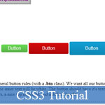 Bài viết này sẽ hướng dẫn bạn tạo ra các nút nhấn HTML với các thuộc tính của CSS3 - một công nghệ mới đang rất nổi tiếng & phổ biến. Mặc dù chỉ là một bài viết đơn giản nhưng cách trình bày rất đơn giản và dễ hiểu, và có sẵn cả ví dụ mẫu CSS3 kèm theo để bạn dễ dàng hình dung.
- Demo
- Phóng to
- Tải lại
- Cửa sổ mới
Miễn phí web hosting 1 năm đầu tại iPage
Nếu bạn vẫn còn đang tìm kiếm một nhà cung cấp hosting đáng tin cậy, tại sao không dành chút thời gian để thử với iPage, chỉ với không quá 40.000 VNĐ/tháng, nhưng bạn sẽ được khuyến mãi kèm với quà tặng trị giá trên 10.000.0000 VNĐ nếu thanh toán cho 24 tháng ~ 900.000 VNĐ?
Có trên 1 triệu khách hàng hiện tại của iPage đã & đang hài lòng với dịch vụ, tuyệt đối chắc chắn bạn cũng sẽ hài lòng giống họ! Quan trọng hơn, khi đăng ký sử dụng web hosting tại iPage thông qua sự giới thiệu của chúng tôi, bạn sẽ được hoàn trả lại toàn bộ số tiền bạn đã sử dụng để mua web hosting tại iPage. Wow, thật tuyệt vời! Bạn không phải tốn bất kì chi phí nào mà vẫn có thể sử dụng miễn phí web hosting chất lượng cao tại iPage trong 12 tháng đầu tiên. Chỉ cần nói chúng tôi biết tài khoản của bạn sau khi đăng ký.
Nếu muốn tìm hiểu thêm về ưu / nhược điểm của iPage, bạn hãy đọc đánh giá của ChọnHostViệt.com nhé!
---
Demo
General Rules
First, let's set up our general button rules (with a .btn class). We want all our buttons to have a colored background, meaning the inner text will be white. The button should have it's text nice and centered, along with some round corners, a nice top highlight, and a default height.
.btn {
  background: #CCC;
  color: #FFF;
  display: inline-block;
  border-radius: 4px;
  box-shadow: inset 0 1px 0 rgba(255,255,255,0.2);
  font-family: Arial, sans-serif;
  line-height: 2.5em;
  padding: 0 3em;
  text-decoration: none;
}
If you want "full" compatibility, remember to add browser prefixes for border-radius and box-shadow, but for simplicity's sake I've left them out here. The box-shadow uses a very subtle, 1px thick value in a semi-transparent white, using an rgba value.
You'll also notice I've set a background color, though it's basically a temporary backup for now. We've set set it to an inline-block element for easier manipulation of properties (line-height won't work properly with the default inline value). With that we can set a line-height, which we've used em for, as well as for some padding on the sides. I've also set the font to Arial, however this is probably not needed unless you want a specific font for just the buttons, otherwise you can remove this line and let it inherit the font you've set globally on the site. At this point, if you were to make some links with the .btn class...
<a href="#" class="btn">Button</a>
<a href="#" class="btn">Button</a>
<a href="#" class="btn">Button</a>
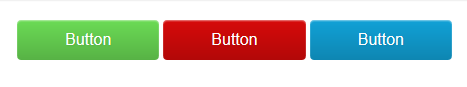
Colors
So far so good. However, we don't want a CSS button set to be so plain, we want some color! So let's make a few more classes in our CSS:
.green.btn {
  background: linear-gradient(#6BDB55,#57B245);
  text-shadow: 1px 1px 1px #57B245;
}

.red.btn {
  background: linear-gradient(#D60A0A,#B20808);
  text-shadow: 1px 1px 1px #B20808;
}

.blue.btn {
  background: linear-gradient(#11A1D6,#0E86B2);
  text-shadow: 1px 1px 1px #0E86B2;
}
Here we've made 3 colors, each using a CSS gradient (again, unprefixed, but you can use this handy tool to get the full prefix list) and applying a dark, colored shadow (matching the darkest color in the gradient). You now have a primary color set that - once you apply each class to your buttons in the HTML - would look like:
Size
Want different sizes? No problem, all we need are some extra classes to adjust our button set's height and padding:
.small.btn {
  line-height: 1.75em;
  padding: 0 1.5em;
}

.large.btn {
  line-height: 3em;
  padding: 0 3.5em;
}
And with that, you can now mix and match your colors with sizes!
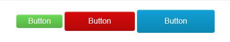
States
Last, but not least, it would be a good idea to have some hover (mouse over) and active (mouse down) states. You can do this per color if you felt like it, but we'll take a simpler approach by using an extra shadow as a "fake gradient" across the whole button set (which will also save us various lines of CSS).
.btn:hover {
  box-shadow: inset 0 1px 1px rgba(255,255,255,0.2),
  inset 0 1.5em 1em rgba(255,255,255,0.3);
}

.btn:active {
  box-shadow: inset 0 1px 1px rgba(255,255,255,0.2),
  inset 0 1.5em 1em rgba(0,0,0,0.3);
}
You'll notice we've added a second value (separated with a comma) to our original shadow, but this time apply a bigger shadow, one light and one dark for each state. With this, your button set is ready for action! To play with a live example from this CSS button tutorial, you can check it out here.
 bởi Xem
- Lượt gửi (0)
- Mới
Save up to 630$ when buy new iPhone 15
GateIO.gomymobi.com
Free Airdrops to Claim, Share Up to $150,000 per Project
https://tooly.win
Open tool hub for free to use by any one for every one with hundreds of tools
chatGPTaz.com, chatGPT4.win, chatGPT2.fun, re-chatGPT.com
Talk to ChatGPT by your mother language
Dall-E-OpenAI.com
Generate creative images automatically with AI
AIVideo-App.com
Render creative video automatically with AI
Cool Domains for Sale!
Tác giả:
Lượt xem:
Lời bình:
Lượt đánh giá:
Lượt gửi:
Kích thước:
Thứ hạng:
CSS Menu Maker [more]
28,828
0
0
0
0.12 KBytes
0 lượt đánh giá / 28,828 lượt xem / 0 lời bình
28/05/2013
Bài viết này sẽ hướng dẫn bạn tạo ra các ...Nút nhấn với CSS3: Hướng dẫn & Ví dụ nhỏ nhưng hữu ích - Nút nhấn với CSS3: Hướng dẫn & Ví dụ nhỏ nhưng hữu ích - Ngôn ngữ: tiếng Việt
