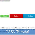
 If you're a senior web developer, you know that on the big web projects, you have to encounter a situation where you need a coherent set of HTML buttons with different properties for each button, be it in size, color, or both. This CSS button tutorial will guide you how to use CSS3 to apply the HTML buttons then make them become more stylish, amazing.
Or you may try many helpful resources below to build the websites better and faster:
- Great Collection of Extreme CSS3, JavaScript Tutorials
- Beautiful and Stunning CSS3 Animation Experiments
- Design Better HTML5 Form Element Validator
- 35 High-Class JavaScript and jQuery Tutorials for Advance Web Developers
- Demo
- Enlarge
- Reload
- New window
Free iPage Web Hosting for First Year NOW
If you're still looking for a reliable web host provider with affordable rates, why you don't take a little of time to try iPage, only with $1.89/month, included $500+ Free Extra Credits for the payment of 24 months ($45)?
Over 1,000,000+ existisng customers can not be wrong, definitely you're not, too! More important, when you register the web hosting at iPage through our link, we're going to be happy for resending a full refund to you. That's awesome! You should try iPage web hosting for FREE now! And contact us for anything you need to know about iPage.
---
Demo
General Rules
First, let's set up our general button rules (with a .btn class). We want all our buttons to have a colored background, meaning the inner text will be white. The button should have it's text nice and centered, along with some round corners, a nice top highlight, and a default height.
.btn {
  background: #CCC;
  color: #FFF;
  display: inline-block;
  border-radius: 4px;
  box-shadow: inset 0 1px 0 rgba(255,255,255,0.2);
  font-family: Arial, sans-serif;
  line-height: 2.5em;
  padding: 0 3em;
  text-decoration: none;
}
If you want "full" compatibility, remember to add browser prefixes for border-radius and box-shadow, but for simplicity's sake I've left them out here. The box-shadow uses a very subtle, 1px thick value in a semi-transparent white, using an rgba value.
You'll also notice I've set a background color, though it's basically a temporary backup for now. We've set set it to an inline-block element for easier manipulation of properties (line-height won't work properly with the default inline value). With that we can set a line-height, which we've used em for, as well as for some padding on the sides. I've also set the font to Arial, however this is probably not needed unless you want a specific font for just the buttons, otherwise you can remove this line and let it inherit the font you've set globally on the site. At this point, if you were to make some links with the .btn class...
<a href="#" class="btn">Button</a>
<a href="#" class="btn">Button</a>
<a href="#" class="btn">Button</a>
Colors
So far so good. However, we don't want a CSS button set to be so plain, we want some color! So let's make a few more classes in our CSS:
.green.btn {
  background: linear-gradient(#6BDB55,#57B245);
  text-shadow: 1px 1px 1px #57B245;
}

.red.btn {
  background: linear-gradient(#D60A0A,#B20808);
  text-shadow: 1px 1px 1px #B20808;
}

.blue.btn {
  background: linear-gradient(#11A1D6,#0E86B2);
  text-shadow: 1px 1px 1px #0E86B2;
}
Here we've made 3 colors, each using a CSS gradient (again, unprefixed, but you can use this handy tool to get the full prefix list) and applying a dark, colored shadow (matching the darkest color in the gradient). You now have a primary color set that - once you apply each class to your buttons in the HTML - would look like:

Size
Want different sizes? No problem, all we need are some extra classes to adjust our button set's height and padding:
.small.btn {
  line-height: 1.75em;
  padding: 0 1.5em;
}

.large.btn {
  line-height: 3em;
  padding: 0 3.5em;
}
And with that, you can now mix and match your colors with sizes!

States
Last, but not least, it would be a good idea to have some hover (mouse over) and active (mouse down) states. You can do this per color if you felt like it, but we'll take a simpler approach by using an extra shadow as a "fake gradient" across the whole button set (which will also save us various lines of CSS).
.btn:hover {
  box-shadow: inset 0 1px 1px rgba(255,255,255,0.2),
  inset 0 1.5em 1em rgba(255,255,255,0.3);
}

.btn:active {
  box-shadow: inset 0 1px 1px rgba(255,255,255,0.2),
  inset 0 1.5em 1em rgba(0,0,0,0.3);
}
You'll notice we've added a second value (separated with a comma) to our original shadow, but this time apply a bigger shadow, one light and one dark for each state. With this, your button set is ready for action! To play with a live example from this CSS button tutorial, you can check it out here.
- Sent (0)
- New
Save up to 630$ when buy new iPhone 15
GateIO.gomymobi.com
Free Airdrops to Claim, Share Up to $150,000 per Project
https://tooly.win
Open tool hub for free to use by any one for every one with hundreds of tools
chatGPTaz.com, chatGPT4.win, chatGPT2.fun, re-chatGPT.com
Talk to ChatGPT by your mother language
Dall-E-OpenAI.com
Generate creative images automatically with AI
AIVideo-App.com
Render creative video automatically with AI


 28/05/2013
 0
0
