Placed in: Home  Programming CSS Sweet tabbed navigation using CSS3 comprar viagra en españa
comprar viagra online
comprar viagra generico barato
comprar cialis generico online
comprar cialis online seguro
Programming CSS Sweet tabbed navigation using CSS3 comprar viagra en españacomprar viagra online
comprar viagra generico barato
comprar cialis generico online
comprar cialis online seguro
| Sweet tabbed navigation using CSS3 |
|
Although I don't understand why animations have been added in CSS3, this upcoming standard does have a couple of very neat features added to the CSS we're using today. I wanted to take a couple of these new things, and create a Sweet tabbed navigation using CSS3. 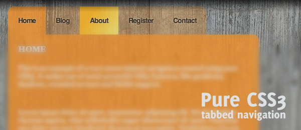
This tutorial takes on the following CSS(3) properties:

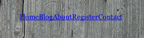
 As you could expect, this demo only works in browsers that support the new CSS3 features. This code fully works in Safari / Firefox 3.6, but hasn't been tested in other browsers. Now let's see how you can create this kind of sweet menu yourself! HTML Before we do anything fancy with CSS, we'll need a decent backbone in the form of HTML. As you can expect, the menu excists from an <div id="menu"> <ul> <li><a href="#" title="Home">Home</a></li> <li><a href="#" title="Blog" class="active">Blog</a></li> <li><a href="#" title="About">About</a></li> <li><a href="#" title="Register">Register</a></li> <li><a href="#" title="Contact">Contact</a></li> </ul> </div> <div id="main"> <h3>Main content header</h3> <p>Main content</p> </div> Nothing really fancy or hard going on here, so I suggest we take our first steps into the CSS. Simple CSS First, we'll need some basic styling to the HTML we just created. We want to display the navigation #menu { margin:40px 0 0 150px; } #menu ul { list-style:none; } #menu ul li { display:inline; float:left; margin-bottom:20px; } Our outcome (see below) might look a little bit dull, these are the foundations we're going to work with in order to achieve what we want.
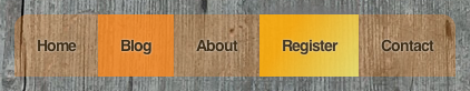
RGBA, opacity and Text-shadow Now, we're going to use some of the CSS3 features to make this simple navigation look beautiful. We'll select the /* background color set to RGBA, with opacity on 0.3 and also using text-shadow */ #menu ul li a { padding:20px; background: rgba(255,138,30,0.3); text-decoration: none; font: bold 14px Helvetica, Sans-Serif; letter-spacing: -1px; color: #402e16; text-shadow: #eee 0px 0px 2px; } We now have already something very fancy looking:

Looks pretty nifty already, doesn't it? But we're not done yet - on to the next step! Pseudo Selectors and Rounded Corners Now that we have our navigation, we'll take it to the next level. The first With the use of pseudo selectors, we can easily find the first and last /* :first-child pseudo selector with rounded top left corner */ #menu ul li:first-child a { -moz-border-radius-topleft: 12px; -webkit-border-top-left-radius:12px; } /* :last-child pseudo selector with rounded top right corner */ #menu ul li:last-child a { -moz-border-radius-topright: 12px; -webkit-border-top-right-radius:12px; } When applied, the menu will look like this:

Whoah - looking better every step! But don't stop here, we'll add some more beauty to this menu in the next step. Gradient and Box-shadow Now that we have our menu fully complete, we want to place the cherry on the cake by styling the The With CSS3, you'll have the ability to create gradients. In this example, I'll go with a simple /* hover state shows a linear gradient and opacity it brought down to 0.9 and also shows a very slight grey shadow on top */ #menu ul li a:hover { -moz-box-shadow: 0 -5px 10px #777; -webkit-box-shadow: 0 -5px 10px #777; background: -webkit-gradient( linear, right bottom, left top, color-stop(0, rgb(237,227,112)), color-stop(0.72, rgb(255,173,10))) !important; background: -moz-linear-gradient( right bottom, rgb(237,227,112) 0%, rgb(255,173,10) 72%) !important; background-color:rgb(255,173,10) !important; -moz-opacity:.90; filter:alpha(opacity=90); opacity:.90; } /* another RGBA background, now with an opacity of 0.8 */ #menu ul li a.active { background: rgba(255,138,30,0.8) !important; } With all that CSS, our menu looks like this (one is
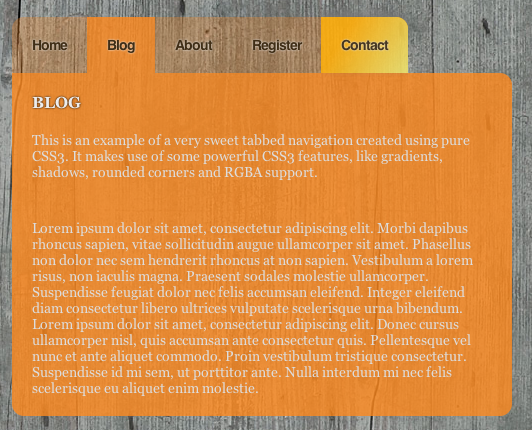
How about that for a sweet CSS3 powered menu! More CSS Since we finished our CSS3 powered menu, we can style our /* main contents with RGBA background (same colour as active tab) and three rounded corners */ #main { clear:both; background: rgba(255,138,30,0.8); width:500px; margin-left:150px; -moz-border-radius-topright: 12px; -moz-border-radius-bottomright: 12px; -moz-border-radius-bottomleft: 12px; -webkit-border-top-right-radius:12px; -webkit-border-bottom-right-radius:12px; -webkit-border-bottom-left-radius:12px;} /* header with a text-shadow */ #main h3 { text-transform:uppercase; padding:20px 0 0 20px; color:#eee; text-shadow: #000 0px 0px 2px; } #main p { padding-bottom:20px; color:#ddd; } With that, our final page looks like this:
And we're done! Conclusion and Download I added a little jQuery script to virtually switch between pages, but of course this needs to be done server-side and show the actual page. I think CSS3 has some very neat features, where some of them are used in a great way in this tutorial. Sadly, since this isn't cross-browser compatible, we'll need to wait for a while before we can use this in the public.
What do you think? Do you see any room for improvement in this code? Do you like it? Feel free to share your two cents! Tags: tabs navigation css3 webdesign css Interested in this topic? You might enjoy another article I've written called |


| < Prev | Next > |
|---|
| Search |
|---|
| Or try the sitemap |
Friends of Marcofolio.net
 2007 - 2018 Marcofolio.net
This (we)blog brings you information about (web)design, blogging tips, (programming) tutorials and much, much more. I can't describe Marcofolio.net in words: Just look around and be amazed. Many (new) visitors have a habit to stick around, just because of the variety of articles.
Have fun reading this blog and don't forget to subscribe to the feed to keep updated on the latest articles.