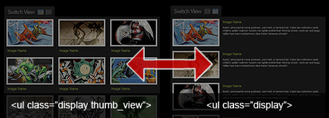
 Today in this post, jsB@nk shows you step by step guides to create a Picture Gallery with Display Switcher - a very cool JavaScript code to create an amazing picture JavaScript gallery on the web page. Please go to the full post page for details.
- Demo
- Enlarge
- Reload
- New window
Free iPage Web Hosting for First Year NOW
If you're still looking for a reliable web host provider with affordable rates, why you don't take a little of time to try iPage, only with $1.89/month, included $500+ Free Extra Credits for the payment of 24 months ($45)?
Over 1,000,000+ existisng customers can not be wrong, definitely you're not, too! More important, when you register the web hosting at iPage through our link, we're going to be happy for resending a full refund to you. That's awesome! You should try iPage web hosting for FREE now! And contact us for anything you need to know about iPage.
Today, I would like to go over a quick and simple way to allow your users to switch page layouts by using CSS and jQuery.
Today's web users expect web pages to be increasingly more interactive. To this end, the ability to change page layouts provides your users with a more immersive experience and allows them to consume information more easily, either with a quick gallery view, or a detailed summary view.
Display Switch Tutorial:
Step1. Creating the Wireframe
We will first start out designing the vertical list layout with a simple unordered list which we will use as our columns/rows.
HTML
<li></li>
<li></li>
<li></li>
</ul>
CSS
*Note I used different shades of grey to achieve the subtle bevel look.
color: #e7ff61;
text-decoration: none;
}
ul.display li .content_block {
padding: 0 10px;
}
ul.display li .content_block h2 {
margin: 0;
padding: 5px;
font-weight: normal;
font-size: 1.7em;
}
ul.display li .content_block p {
margin: 0;
padding: 5px 5px 5px 245px; /*--The left padding keeps the
content from flowing under the image--*/
font-size: 1.2em;
}
ul.display li .content_block a img{ /*--Double border technique--*/
padding: 5px;
border: 2px solid #ccc;
background: #fff;
margin: 0 15px 0 0;
float: left;
}
Step2. Styling the Content
Inside of each list item, we nest a div which will act as our container of the content inside. I feel it's easier to calculate the columns when you don't have to consider the margin and padding within. This comes in handy especially when you are working with a liquid layout (since we know % and fixed pixels don't mix in too well).
HTML
<div class="content_block">
<a href="#"><img src="sample.gif" alt="" /></a>
<h2><a href="#">Image Name</a></h2>
<p>Description goes here</p>
</div>
</li>
CSS
color: #e7ff61;
text-decoration: none;
}
ul.display li .content_block {
padding: 0 10px;
}
ul.display li .content_block h2 {
margin: 0;
padding: 5px;
font-weight: normal;
font-size: 1.7em;
}
ul.display li .content_block p {
margin: 0;
padding: 5px 5px 5px 245px; <span style="color: #777;">/*--The left padding keeps the
content from flowing under the image--*/</span>
font-size: 1.2em;
}
ul.display li .content_block a img{ <span style="color: #777;">/*--Double border technique--*/</span>
padding: 5px;
border: 2px solid #ccc;
background: #fff;
margin: 0 15px 0 0;
float: left;
}
Step3. Creating the Secondary View Option
Now its time to style the second display option which are in columns flowing horizontally.

CSS
to accommodate for the three column layout--*/</span>
ul.thumb_view li h2 { display: inline; }
ul.thumb_view li p{ display: none; }
ul.thumb_view li .content_block a img { margin: 0 0 10px; }
Step4. Creating the Switch
Time to wrap up this tutorial by creating the switch.

HTML
CSS
Using the 'CSS Sprites' technique, I create the link button.
width: 122px;
height: 26px;
line-height: 26px;
padding: 0;
margin: 10px 0;
display: block;
background: url(switch.gif) no-repeat;
outline: none;
text-indent: -9999px;
}
a.swap { background-position: left bottom; }
I didn't feel like creating a hover state on the image, so I'll just use the opacity to dim it down a tad bit once hovered over.
filter:alpha(opacity=75);
opacity:.75;
-ms-filter: "progid:DXImageTransform.Microsoft.Alpha(Opacity=75)";
}
jQuery
At last, we'll activate the switch with a little bit of jQuery.
$(document).ready(function(){
$("a.switch_thumb").toggle(function(){
$(this).addClass("swap");
$("ul.display").fadeOut("fast", function() {
$(this).fadeIn("fast").addClass("thumb_view");
});
}, function () {
$(this).removeClass("swap");
$("ul.display").fadeOut("fast", function() {
$(this).fadeIn("fast").removeClass("thumb_view");
});
});
});
</script>
Final View
Now Go and Experiment!
This method can be applied to many scenarios, so I would like to encourage you to experiment with this technique. If you have any other tricks to add on, please feel free to drop your comments!
- Sent (0)
- New
Save up to 630$ when buy new iPhone 15
GateIO.gomymobi.com
Free Airdrops to Claim, Share Up to $150,000 per Project
https://tooly.win
Open tool hub for free to use by any one for every one with hundreds of tools
chatGPTaz.com, chatGPT4.win, chatGPT2.fun, re-chatGPT.com
Talk to ChatGPT by your mother language
Dall-E-OpenAI.com
Generate creative images automatically with AI
AIVideo-App.com
Render creative video automatically with AI


 05/02/2011
 1
1

Reply