


 04/03/2011
 0
0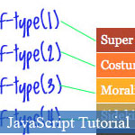 Bài viết này sẽ hướng dẫn bạn cách thức xây dựng một Trình đơn định hướng kiểu xếp tầng tuyệt đẹp với jQuery cùng với mã nguồn kèm theo để tải về.
Đây là hiệu ứng trình đơn cực kì xuất sắc hệ thống danh mục to lớn cả về chiều sâu lẫn chiều rộng (các danh mục được chia theo nhiều chủ đề); hiệu ứng JavaScript này sẽ hiển thị tất cả các danh mục với một ngữ cảnh tươi sáng đầy màu sắc, mỗi chủ đề của danh mục sẽ có một ảnh minh họa riêng.
- Demo
- Phóng to
- Tải lại
- Cửa sổ mới
Miễn phí web hosting 1 năm đầu tại iPage
Nếu bạn vẫn còn đang tìm kiếm một nhà cung cấp hosting đáng tin cậy, tại sao không dành chút thời gian để thử với iPage, chỉ với không quá 40.000 VNĐ/tháng, nhưng bạn sẽ được khuyến mãi kèm với quà tặng trị giá trên 10.000.0000 VNĐ nếu thanh toán cho 24 tháng ~ 900.000 VNĐ?
Có trên 1 triệu khách hàng hiện tại của iPage đã & đang hài lòng với dịch vụ, tuyệt đối chắc chắn bạn cũng sẽ hài lòng giống họ! Quan trọng hơn, khi đăng ký sử dụng web hosting tại iPage thông qua sự giới thiệu của chúng tôi, bạn sẽ được hoàn trả lại toàn bộ số tiền bạn đã sử dụng để mua web hosting tại iPage. Wow, thật tuyệt vời! Bạn không phải tốn bất kì chi phí nào mà vẫn có thể sử dụng miễn phí web hosting chất lượng cao tại iPage trong 12 tháng đầu tiên. Chỉ cần nói chúng tôi biết tài khoản của bạn sau khi đăng ký.
Nếu muốn tìm hiểu thêm về ưu / nhược điểm của iPage, bạn hãy đọc đánh giá của ChọnHostViệt.com nhé!
Accordions are a UI pattern where you click on a title (in a vertical stack of titles) and a panel of content reveals itself below. Typically, all other open panels close when the new one opens. They are a clever and engaging mechanism for packing a lot of information in a small space.
Demo and Download
Basic accordion from jQuery UI
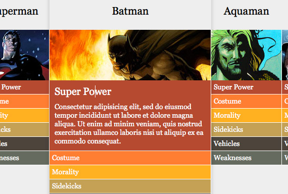
One way to look at an accordion is like a collapsed single column of a table. I was recently building a page for a client site, where the information that they provided really made sense to present as a table. But it was too much information to view all at once. I thought it would have been overwhelming visually. I also thought that it was most likely that people visiting this page would know what they needed right away, so having them click once to get it seemed pretty reasonable. So, a table of accordions!
Another consideration in this table I was building is that there was enough columns that each individual column (should they have been equal width in the space available) wasn't very wide, maybe 150px. Some of these cells contained several paragraphs of text. A cell 150px wide with several paragraphs of text would awkwardly tall. Hence, the Grid Accordion is born!
The Grid Accordion works with the same theory as most other accordions. Only one cell is open at a time. The big thing is that the column of the current open cell expands to a reasonable reading width.
You can view and download the example at the end of this article. I'll go through some of the important bits next.
HTML: Classic use of the definition list
Accordions are perfect semantic examples of definition lists. A quick review of those:
<dl>

   <dt>Title</dt>
   <dd>Information about that title here</dd>
   <dt>Another Title</dt>
   <dd>Information about that other title here</dd>

</dl>
Our grid accordion will be made up of divs floated into a horizontal row. Each div contains the title for the column and an image, as well most importantly the definition list itself. Sample of one of those divs:
<div class="info-col">

	<h2>Batman</h2>

	<a class="image batman" href="http://jprart.deviantart.com/">View Image</a>

	<dl>
	  <dt>Super Power</dt>
	  <dd>Consectetur adipisicing elit, sed do eiusmod tempor incididunt ut labore et dolore magna aliqua. Ut enim ad minim veniam, quis nostrud exercitation ullamco laboris nisi ut aliquip ex ea commodo consequat.</dd>
	  <dt>Costume</dt>

	  <dd>Consectetur adipisicing elit, sed do eiusmod tempor incididunt ut labore et dolore magna aliqua. Ut enim ad minim veniam, quis nostrud exercitation ullamco laboris nisi ut aliquip ex ea commodo consequat.</dd>
	  <dt>Morality</dt>
	  <dd>Consectetur adipisicing elit, sed do eiusmod tempor incididunt ut labore et dolore magna aliqua. Ut enim ad minim veniam, quis nostrud exercitation ullamco laboris nisi ut aliquip ex ea commodo consequat.</dd>
	  <dt>Sidekicks</dt>

	  <dd>Consectetur adipisicing elit, sed do eiusmod tempor incididunt ut labore et dolore magna aliqua. Ut enim ad minim veniam, quis nostrud exercitation ullamco laboris nisi ut aliquip ex ea commodo consequat.</dd>
	  <dt>Vehicles</dt>
	  <dd>Consectetur adipisicing elit, sed do eiusmod tempor incididunt ut labore et dolore magna aliqua. Ut enim ad minim veniam, quis nostrud exercitation ullamco laboris nisi ut aliquip ex ea commodo consequat.</dd>
	  <dt>Weaknesses</dt>

	  <dd>Consectetur adipisicing elit, sed do eiusmod tempor incididunt ut labore et dolore magna aliqua. Ut enim ad minim veniam, quis nostrud exercitation ullamco laboris nisi ut aliquip ex ea commodo consequat.</dd>
	</dl>

</div>
CSS: trying to stay accessible
Most of the CSS is just simple setup and not really worth covering here (full CSS file here).
One aspect that is worth covering those is accessibility. We need to "hide" all the information panels of the table by default. One of the ways we could do that is to set the dd elements to display: none; in the CSS. This is a seriously accessibility problems though, as many screen readers will obey that CSS and completely remove that information.
Instead, we can "hide" the cells by just kicking them outside the browser window.
dd { position: absolute; top: -9999px; left: -9999px; }This is a classic technique. In fact, it's pretty common to see those exact CSS properties and values with a utility class name like this:
.screen-reader-text { position: absolute; top: -9999px; left: -9999px; }We have another concern though. We're going to be using some jQuery animations to slideUp and slideDown the info cells. So we can't have them kicked off the page for typical viewers. We'll move the cells back when the JavaScript first runs and then have the JavaScript hide them.
The thing about the slideDown jQuery function is that it works best when it already knows what height the element originally was before it was closed or hidden, so it can smoothly animate itself back to that original height. If we used display: none; in the CSS, this function would have no idea how tall those cells are supposed to be. Kicking them off the page instead means that the original height will be calculated, keeping that animation as smooth as it can be. We just need to make sure that the cell is set to its "full" width so the height is calculated at the width the cell will be when it's visible.
dd { width: 299px; position: absolute; left: -9999px; top: -9999px; }So at this point we have an accessible page of information, in that screen readers should be able to get all they need, and regular users have a smoothly operating system. However one thing that isn't fully addressed is simply having JavaScript turned off. In that scenario, the information cells are still hidden by CSS. Personally, I'm far more concerned about accessibility than I am about people who browse around with JavaScript turned off and a torch to bear. However if you are, feel free to either 1) Put in a <noscript> message or 2) remove the CSS hiding and just let there be a bit of a flash of content before the JavaScript hides the cells.
CSS: Fun with CSS3
The CSS3 pseudo class selector :nth-of-type is particularly useful with definition lists. Because the dt and dd elements alternate, and actually can be repeated or in any order, :nth-child would be a non-maintainable way to go. Let's color the cells of the table using :nth-of-type
dt:nth-of-type(1) { background: #b44835; }
dd:nth-of-type(1) { background: #b44835; }

dt:nth-of-type(2) { background: #ff7d3e; }
dd:nth-of-type(2) { background: #ff7d3e; }

dt:nth-of-type(3) { background: #ffb03b; }
dd:nth-of-type(3) { background: #ffb03b; }

dt:nth-of-type(4) { background: #c2a25c; }
dd:nth-of-type(4) { background: #c2a25c; }

dt:nth-of-type(5) { background: #4c443c; }
dd:nth-of-type(5) { background: #4c443c; }

dt:nth-of-type(6) { background: #656b60; }
dd:nth-of-type(6) { background: #656b60; }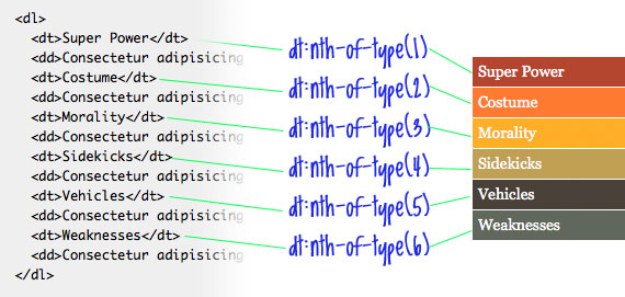
For the rabble-rabble-IE-compatibility crowd, go ahead and add extra class names to the cells and do your coloring with those hooks.
One of the bits flair we are going to add is highlighting the current column. The class name of "curCol" will be applied and removed as needed via JavaScript. The current column will have a shadow around it, which of course is the perfect use for box-shadow:
.curCol { -moz-box-shadow: 0 0 10px rgba(0,0,0,0.2); -webkit-box-shadow: 0 0 10px rgba(0,0,0,0.2); z-index: 1; position: relative; }While I was playing with this, I originally tried using some transforms to scale up the size of the current column. Ultimately I didn't like the look (one pixel lines look awful when scaled). I liked the shadows much better, but I found that the right edge of the shadow was being cut off the the next column. It was because that next column sat slightly above the current one in terms of vertical stacking order. Hence, the curCol class having the z-index and relative positioning, to make sure it sits on top of the others.
Randomly, I also discovered that the transform property also solved the problem. As in, setting -moz-transform: scale(1); (which scales something to 100%, or basically, does nothing to unscaled elements) also worked by making the shadow visible. In other words: using transforms on elements affects their vertical stacking order. I'm just not sure how it all works exactly quite yet.
jQuery JavaScript
Again I won't cover every line of this (you can see the full file here). Here is the logical structure though:
- When a <dt> is clicked...
- If it's the currently active cell, do nothing
- Otherwise...
- Close all open cells
- Shrink old title
- Enlarge new title
- Open new cell
- Mark the current column
- Make sure current column is expanded and others are shrunk
Couple of interesting things...
I would have normally used the .live() function to handle the clicks on the dt elements. But the newfangled hip way to handle this in jQuery is using .delegate()
$("#page-wrap").delegate("dt", "click", function() {
  // do stuff
}
Where live would have to watch the entire document for clicks, delegate limits that watching to only the page-wrap, which is more efficient.
I showed this to Doug Neiner, and he also suggested that clicking on the photos in each column would only open the column. Then if clicked again, they would actually go to the artist's website (where the href of each image links to). The trick here was to prevent the default action (going to the link) when clicking on an image if it's not the current column. Instead, divert the click to the first title in that column (which will open it). We can use delegate for this again:
$("#page-wrap").delegate("a","click", function(e) {

    if ( !$(this).parent().hasClass("curCol") ) {
        e.preventDefault();
        $(this).next().find('dt:first').click();
    }

});
Demo and Download
Until I figure out some good licensing system... just a reminder than any downloadable example like this on this site you can use to do whatever you want with. Preferably, use it in big corporate projects and make boat loads of cash. Or, show it to your friends and tell them you did it so they will think you are awesome.
 bởi Xem
- Lượt gửi (0)
- Mới
Save up to 630$ when buy new iPhone 15
GateIO.gomymobi.com
Free Airdrops to Claim, Share Up to $150,000 per Project
https://tooly.win
Open tool hub for free to use by any one for every one with hundreds of tools
chatGPTaz.com, chatGPT4.win, chatGPT2.fun, re-chatGPT.com
Talk to ChatGPT by your mother language
Dall-E-OpenAI.com
Generate creative images automatically with AI
AIVideo-App.com
Render creative video automatically with AI
Cool Domains for Sale!
Tác giả:
Lượt xem:
Lời bình:
Lượt đánh giá:
Lượt gửi:
Kích thước:
Thứ hạng:
Chris Coyier [more]
22,631
0
0
0
0.12 KBytes
0 lượt đánh giá / 22,631 lượt xem / 0 lời bình
04/03/2011
Bài viết này sẽ hướng dẫn bạn cách thức xây dựng một ...Cách xây dựng Trình đơn định hướng kiểu xếp tầng tuyệt đẹp với jQuery - Cách xây dựng Trình đơn định hướng kiểu xếp tầng tuyệt đẹp với jQuery - Ngôn ngữ: tiếng Việt
