


 31/01/2011
 0
0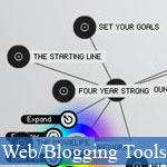 Mấy ngày nay chỉ xem các bài viết đậm chất kĩ thuật trên jsB@nk có lẽ đã làm bạn chán ngấy!? Hôm nay chúng ta hãy cùng nhau đổi không khí với bài viết này, cùng nhau thưởng thức các ứng dụng web cực kì tuyệt đẹp. Hầu hết các ứng dụng web được giới thiệu trong bài viết này chủ yếu để mô phỏng, trình bày dữ liệu (data visualization) nhưng lại có giao diện và cách thức hoạt động cực kì độc đáo và bắt mắt; chắc chắn sẽ cung cấp cho bạn nhưng trải nghiệm web tuyệt vời nhất.
Nếu vẫn chưa thỏa mãn, bạn hãy thưởng thức thêm:
- 50 trò chơi nhỏ gây nghiện trên Facebook
- 65 giải pháp trình diễn ảnh tuyệt vời mà miễn phí
- 10 điều JavaScript xưa không làm được
- Các thư viện JavaScript xử lý 3D đáng kinh ngạc
- Các trải nghiệm JavaScript tuyệt đẹp trên Chrome, Safari
- 12 trò chơi JavaScript đầy sáng tạo bạn nên chơi
- Demo
- Phóng to
- Tải lại
- Cửa sổ mới
Miễn phí web hosting 1 năm đầu tại iPage
Nếu bạn vẫn còn đang tìm kiếm một nhà cung cấp hosting đáng tin cậy, tại sao không dành chút thời gian để thử với iPage, chỉ với không quá 40.000 VNĐ/tháng, nhưng bạn sẽ được khuyến mãi kèm với quà tặng trị giá trên 10.000.0000 VNĐ nếu thanh toán cho 24 tháng ~ 900.000 VNĐ?
Có trên 1 triệu khách hàng hiện tại của iPage đã & đang hài lòng với dịch vụ, tuyệt đối chắc chắn bạn cũng sẽ hài lòng giống họ! Quan trọng hơn, khi đăng ký sử dụng web hosting tại iPage thông qua sự giới thiệu của chúng tôi, bạn sẽ được hoàn trả lại toàn bộ số tiền bạn đã sử dụng để mua web hosting tại iPage. Wow, thật tuyệt vời! Bạn không phải tốn bất kì chi phí nào mà vẫn có thể sử dụng miễn phí web hosting chất lượng cao tại iPage trong 12 tháng đầu tiên. Chỉ cần nói chúng tôi biết tài khoản của bạn sau khi đăng ký.
Nếu muốn tìm hiểu thêm về ưu / nhược điểm của iPage, bạn hãy đọc đánh giá của ChọnHostViệt.com nhé!
Miscellaneous Visualizations and Tools
Visualizing Information Flow in Science includes a set of four visualizations showing relationships between citations in scholarly journals that are used to evaluate the importance of each journal.
The Micro Fashion Network: Color visualizations show the continuous change of styles in fashion, with a particular look at the basic elements of color. It was created by using a fixed camera and special software to map the colors of clothing people in Cambridge were wearing.
The TED Sphere shows videos from the TED conference in a spherical format with 3D navigation. You can view the sphere from inside or outside and the layout of videos is based on semantic compatibility.
Visualizing The Bible gives a visual overview of more than 63,000 textual cross-references within the Bible. It's intention is to be more beautiful than functional.
Walrus is a visualization tool that allows you to interact with massive graphs in a 3D interface. Interaction is based on selecting any node and then having the graph zoom in to expand on that point.
We Feel Fine is one of the most interesting visualization tools I came across. It provides visualizations on the general feelings populating the blogosphere on any given day. You can filter results based on age, location, gender, weather, and other criteria. There are six different visualizations available: Madness, Murmurs, Montage, Mobs, Metrics, and Mounds, each of which give a different portrait of the general feelings abounding on the internet.
One Week of The Guardian is a visualization of the stories from The Guardian newspaper. It focuses on the relationships between headlines, authors, pages, and categories.
Nemulator is a project that aims to visualize "nemes," or different fragments of states of mind. It also aims to serve as a starting point for discussions relating to the scalability of nemes.
Voyage is a web-based RSS reader that visually displays RSS feeds on a timeline. It's a great way to explore the different feeds you subscribe in a completely different format.
Blooming Numbers is the 2006 CGD MFA Thesis Project of Yuri Lee. It's goal is to show the relationships between preferences of numbers and cultural contexts in an interactive way.
CIA World Factbook Visualization shows a visualization of relationships between different countries and continents based on data from the CIA World Factbook. It shows semantic relationships for each country, including neighboring countries, languages, water and terrestrial boundaries, and more.
TextArc Visualization of The History of Science is a static visualization of the book The History of Science. It was originally displayed at the NYPL Science, Industry, and Business Library in New York.
This Newspaper Map is a visualization of the rules of the daily production of a newspaper is a striking graphic format. The closeness of words signifies their relationships with each other as do lines traced between words.
GraphNews is a news visualization browser from the Libero WebNews service. It shows news stories in a mind-map-like format. Clicking on one node recreates the graph with the clicked item as the focus.
Newsmap shows a visual representation of current headlines on Google News. It shows the relationships and patterns between different news stories across cultures and within different news segments. Be sure to click to the new JavaScript version for the best features.
FreeMind is a Java-based mind mapping software that allows you to build your own data visualizations quickly and easily. Finished maps can be exported into clickable XHTML files as well as other formats.
Resource System Reference Database was presented as a poster at InfoVis2004, IEEE's annual conference. In this visualization, line weight shows the strength of relationships.
Is the New documents instances of the phrase "is the new" and shows the relationships between the subject and object of that phrase. Examples include "Purple is the new pink" and "Technology is the new religion."
WikiMindMap is a tool to visually browse Wiki content in a mind-map format and includes the ability to download any of their mindmaps in FreeMind format.
How Scientific Paradigms Relate shows the relationships between more than 700 scientific paradigms based on how they were mentioned in more than 800,000 scientific papers. Relationships are also based on how often different papers were cited by each other and by authors of other papers.
Universe is a great app for visualizing the "universe" of particular search terms. There are sample terms available or you can input whatever you choose. The visualization given is reminiscent of astronomical charts.
visualcomplexity.com isn't strictly a visualization software, but rather a collection of visualizations already created and categorized. Categories include business networks, art, internet, knowledge networks, biology, transportation networks, social networks, and more.
The Strengths of Nations is a visualization of the scientific advancement of ten different nations, including the United States, United Kingdom, France, China, and Australia. The map analyzes 23 different scientific areas, including math, biochemistry, and astrophysics.
- Lượt gửi (0)
- Mới
Save up to 630$ when buy new iPhone 15
GateIO.gomymobi.com
Free Airdrops to Claim, Share Up to $150,000 per Project
https://tooly.win
Open tool hub for free to use by any one for every one with hundreds of tools
chatGPTaz.com, chatGPT4.win, chatGPT2.fun, re-chatGPT.com
Talk to ChatGPT by your mother language
Dall-E-OpenAI.com
Generate creative images automatically with AI
AIVideo-App.com
Render creative video automatically with AI
Cool Domains for Sale!
Tác giả:
Lượt xem:
Lời bình:
Lượt đánh giá:
Lượt gửi:
Kích thước:
Thứ hạng:
WebDesignerDepot [more]
97,276
0
0
0
4.1 KBytes
0 lượt đánh giá / 97,276 lượt xem / 0 lời bình
31/01/2011
Mấy ngày nay chỉ xem các bài viết đậm chất kĩ thuật trên jsB@nk có lẽ đã làm bạn chán ngấy!...50+ trải nghiệm tuyệt đẹp với các ứng dụng web - 50+ trải nghiệm tuyệt đẹp với các ứng dụng web - Ngôn ngữ: tiếng Việt
