


Guest, enregistrer login
 Peut-?tre vient de lire techniques tutoriels article JavaScript sur ACC @ nk vous a fait devenir banal?! Pr?s des applications web dans ce message sont visualiseurs de donn?es, mais ils ont les dessins ?tonnants avec des animations magnifiques et uniques, il est ?vident qu'ils peuvent nous donner les exp?riences grande toile ? cette tourn?e On peut tenter des exp?riences Web tels que: Musique, films et autres m?dias; Digg, Twitter, Delicious et Flickr; visualisations Internet; visualisations et outils divers Si les exp?riences Web dans ce message encore ne vous satisfont pas, s'il vous pla?t essayer plus:
? Top 50 Most Addictive et jeux populaires mini Facebook - 65 Free JavaScript Galerie de photos - 10 choses que JavaScript Old ne ferait pas - Incroyable et Amazing 3D Canvas JavaScript Enginges - Vitrines Grande Exp?rience JavaScript sur Chrome, Safari - 12 Awesome et Creative Jeux JavaScript vous devriez essayer
Mapping the Blogosphere is a collection of maps of the blogosphere, including hyperbolic maps, as shown here.
The Twingly Screensaver visualizes the blogosphere worldwide in real time. You get a continuous feed of blog activity straight to your screen.
Web Trend Map 4 shows a visualization of current trends online. This is the fourth iteration of this map and the most detailed one yet.
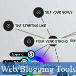
The Bloom Diagram is a project from the IBM Watson Research Center that visualizes the contributions of individuals to open source projects.
Akami Real-time Web Monitor shows a map of the world with real-time information about internet traffic, latency and current network attacks. The maps are color-coded and easy to read, but only give very generalized information.
The Mapa de Conocimiento (Map of Knowledge) is a schematic of knowledge involved in any given idea or project. Built in Flash, this tool visualizes a group of URLs organized under main ideas. The map is available in English and Spanish.
Akami Network Performance Comparison shows the packet loss and network speeds between different cities around the world (to showcase how their technology is better than the standard "public" internet). It also shows graphs of the information.
Internet Health Report shows the latency, packet loss, and network availability of the major ISPs and backbone providers worldwide in a color-coded grid format. Hovering over any of the cells in the grid gives more information about the health of that particular connection.
The Hierarchical Structure of the Internet was a study that looks at how the Internet is organized, both in terms of structure and connectivity. It shows how the central core of the Internet is made up of about 80 core nodes, but that even if those nodes failed, 70% of the other nodes would still function via peer-to-peer connections.
Rootzmap-Mapping the Internet is a series of maps based on data sets provided by NASA and created by Philippe Bourcier. There are a number of different maps available.
Websites as Graphs shows the structure of different websites based on the tags used in their code in a color-coded map that grows on the screen as you watch. Tags are somewhat intuitive in their color-codes, with blue for links, red for tables, and gray for any tags not specifically given a color.
Schemaball visualizes SQL database schema. Relationships are shown based on foreign keys within tables. It's capable of showing schemas with hundreds of different tables and relationships.
The Opte Project aims to map every class C network on the Internet from a single computer and a single Internet connection. The overall goal is to create a map of the entire Internet.
0 votes / 97,309 previews / 0 commentaire
31/01/2011
Peut-?tre vient de lire techniques tutoriels article JavaScript sur ACC @ nk vous a f...Applications Web 50 + Grande de visualisation des donn?es - Applications Web 50 + Grande de visualisation des donn?es - Langue: Française
Définir comme page d'accueil - Ajouter aux Favoris - Recommandez-nous - Newsletter - Google+


 31/01/2011
 0
0