


 24/05/2011
 0
0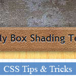 Bài viết này hướng dẫn bạn xây dựng các bóng mờ cho khung chỉ với kĩ thuật CSS. Bài viết có hướng dẫn khá chi tiết cùng với một ví dụ mẫu JavaScript khá đẹp. Hy vọng bài viết này có thể giúp ích cho bạn, vui lòng vào trang chi tiết để xem thêm.
- Demo
- Phóng to
- Tải lại
- Cửa sổ mới
Miễn phí web hosting 1 năm đầu tại iPage
Nếu bạn vẫn còn đang tìm kiếm một nhà cung cấp hosting đáng tin cậy, tại sao không dành chút thời gian để thử với iPage, chỉ với không quá 40.000 VNĐ/tháng, nhưng bạn sẽ được khuyến mãi kèm với quà tặng trị giá trên 10.000.0000 VNĐ nếu thanh toán cho 24 tháng ~ 900.000 VNĐ?
Có trên 1 triệu khách hàng hiện tại của iPage đã & đang hài lòng với dịch vụ, tuyệt đối chắc chắn bạn cũng sẽ hài lòng giống họ! Quan trọng hơn, khi đăng ký sử dụng web hosting tại iPage thông qua sự giới thiệu của chúng tôi, bạn sẽ được hoàn trả lại toàn bộ số tiền bạn đã sử dụng để mua web hosting tại iPage. Wow, thật tuyệt vời! Bạn không phải tốn bất kì chi phí nào mà vẫn có thể sử dụng miễn phí web hosting chất lượng cao tại iPage trong 12 tháng đầu tiên. Chỉ cần nói chúng tôi biết tài khoản của bạn sau khi đăng ký.
Nếu muốn tìm hiểu thêm về ưu / nhược điểm của iPage, bạn hãy đọc đánh giá của ChọnHostViệt.com nhé!
Here is a fun technique to add shading to your web pages using only CSS with PNG images, without using JavaScript, Flash, server-side scripting, or Photoshop, and remain totally independent from colors and textures.
Try it demo. Download the source
Background
Most shading techniques suffer the drawback of the core technology they use:
- Photoshop: images must be individually styled for each pattern combination
- Javascript: CPU intensive
The main issue with Photoshop techniques comes from the time spent creating images, and from the complexity of the code to keep tack of them. For each color/teture combination, 8 images (4 corners and 4 edges) are required.
One technique called �sliding door� reduces these elements to 6, but requires larger images:
A new approach
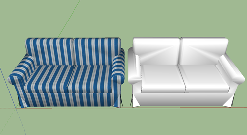
Our technique is based on the same basic idea used in 3D rendering engines which separate textures from shading. Here is an example showing the difference between shades + textures, and shades only:
The first step is to create the shade PND images. Simply use a mask to hide the box content (see the included files):

To optimize this technique, we can reduce the top and bottom elements� width, and the left and right elements� height to one pixel.

To use on a web page, we simply create a box element normally, wrap it in a �shade� container and add the required elements.
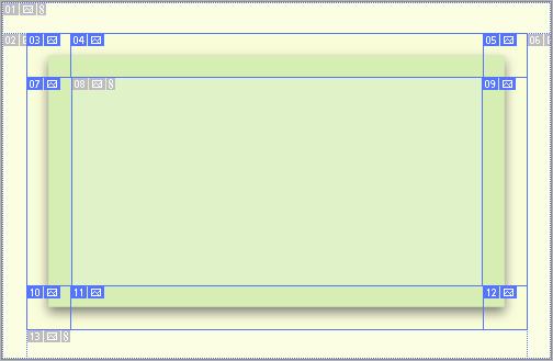
For the most complex case:
<div class='shade'>


 <div class='box'>


  <!-- content -->


 </div>


 <div class='TL' />


 <div class='T' />


 <div class='TR' />


 <div class='L' />


 <div class='C' />


 <div class='R' />


 <div class='BL' />


 <div class='B' />


 <div class='BR' />


</div>
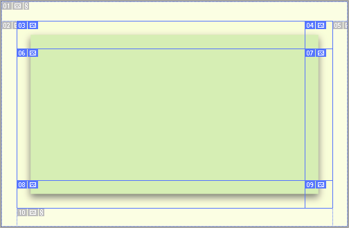
For fixed-with boxes, such as page containers, we only require 3 elements (top, center, and bottom):
<div class='shade'>


 <div class='box'>


  <!-- content -->


 </div>


 <div class='T' />


 <div class='C' />


 <div class='B' />


</div>
Likewise, fixed-height boxed such as title containers only require 3 elements (left, center, and right):
<div class='shade'>


 <div class='box'>


  <!-- content -->


 </div>


 <div class='L' />


 <div class='C' />


 <div class='R' />


</div>
You do not have to create the shade element, you can just apply the shade class to an existing one. The only purpose of the shade element is to serve as a wrapper and an anchor for absolute positioning.
Fore each shading element, we define a negative margin (here 10 px) to accommodate the shade and use a negative z-positioning to place the shade below the content of the box.
.shade {


 position:relative;


}


.shade .TL, .shade .T, .shade .TR,


.shade .L, .shade .C, .shade .R,


.shade .BL, .shade .B, .shade .TB {


 position:absolute;


 z-index: -1;


 top:-10px;


 left:-10px;


 right:-10px;


 bottom:-10px;


}


.shade .TL {


 background: url(s/tl.png) no-repeat left top;


}


...
As always, the best way to fully understand a technique is to look at a demo, or to download the source. Next time, we will look at a Drupal theme which implements this technique.
Cheers!
JF
 bởi Xem
- Lượt gửi (0)
- Mới
Save up to 630$ when buy new iPhone 15
GateIO.gomymobi.com
Free Airdrops to Claim, Share Up to $150,000 per Project
https://tooly.win
Open tool hub for free to use by any one for every one with hundreds of tools
chatGPTaz.com, chatGPT4.win, chatGPT2.fun, re-chatGPT.com
Talk to ChatGPT by your mother language
Dall-E-OpenAI.com
Generate creative images automatically with AI
AIVideo-App.com
Render creative video automatically with AI
Cool Domains for Sale!
Tác giả:
Lượt xem:
Lời bình:
Lượt đánh giá:
Lượt gửi:
Kích thước:
Thứ hạng:
JF [more]
19,372
0
0
0
0.21 KBytes
0 lượt đánh giá / 19,372 lượt xem / 0 lời bình
24/05/2011
Bài viết này hướng dẫn bạn xây dựng các bóng mờ cho khung chỉ với kĩ thuật CSS. Bài viết có...Kĩ thuật tạo bóng mờ chỉ với CSS - JID: 2612 - Kĩ thuật tạo bóng mờ chỉ với CSS - Ngôn ngữ: tiếng Việt
